Mobile First: Why Responsive Design is Essential in 2024
With mobile devices now surpassing desktops for internet browsing, responsive design is no longer a trend, it's a necessity.

David Lee, Web Developer
10 Aug 2023
The Future is Mobile: Why Responsive Design is Essential
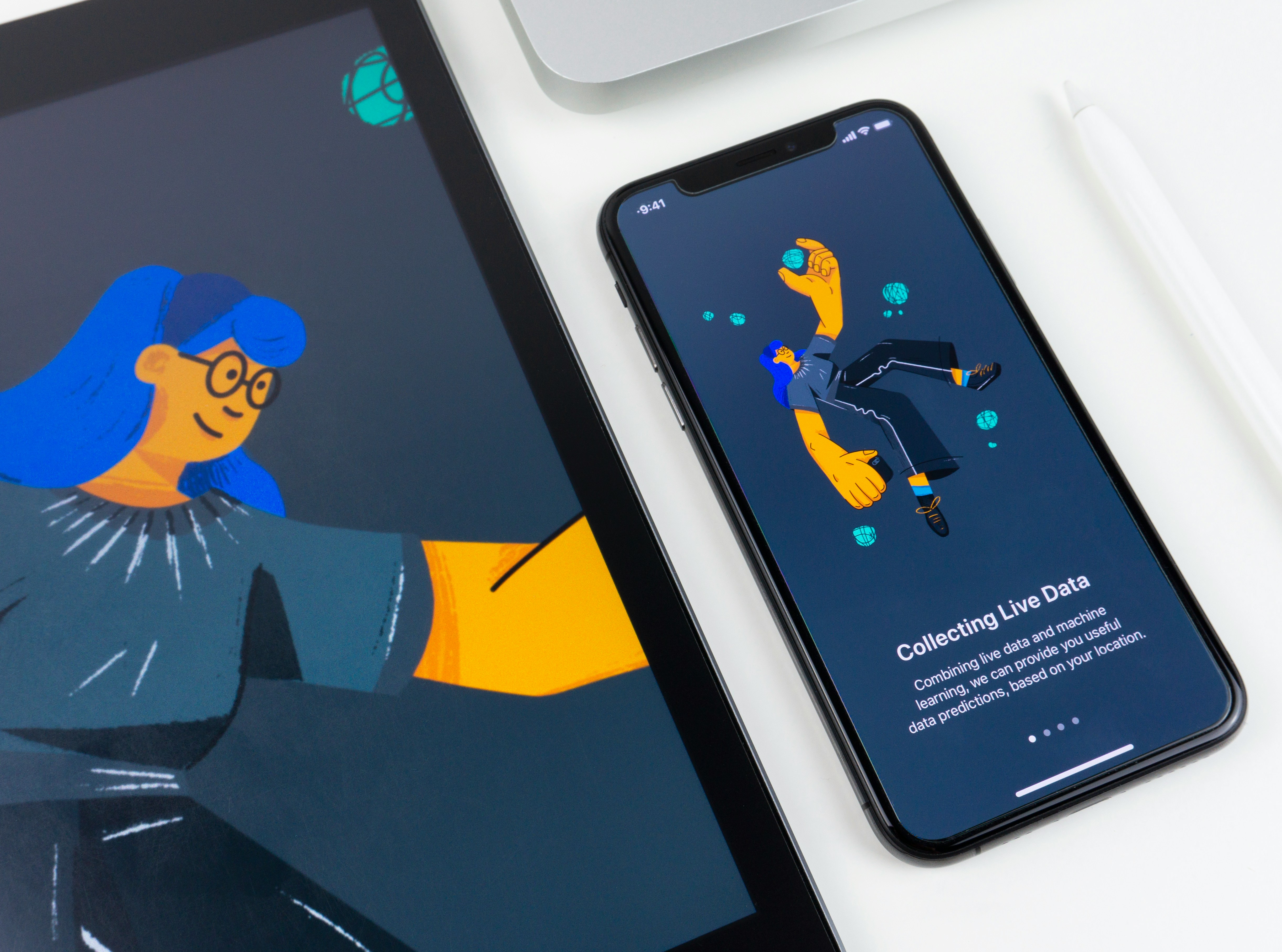
With mobile devices now surpassing desktops for internet browsing, responsive design is no longer a trend, it's a necessity. This blog post explains what responsive design is and why it's crucial for your website. Responsive design ensures your website adapts seamlessly across various screen sizes, from desktops to tablets and smartphones.

Ensuring a Flawless Mobile Experience: Optimizing Websites for Different Devices
Responsive design goes beyond simply adjusting the layout. It involves optimizing images, menus, and content for different screen sizes. For example, high-resolution images on a desktop website can lead to slow loading times on mobile devices. Responsive design ensures images resize automatically, maintaining a fast loading speed across all devices.
Responsive design also ensures menus are easy to navigate on touchscreens. Large dropdown menus on desktops might not translate well to mobile. By implementing responsive menus, like hamburger menus or simplified navigation bars, users can access website content with ease, regardless of the device they use.
Investing in responsive design guarantees your website reaches its full potential. Your audience will have a positive experience regardless of the device they use, leading to higher engagement and conversions. Responsive design is also a crucial factor for SEO, as search engines prioritize mobile-friendly websites in search results.
Mobile First: Why Responsive Design is Essential in 2024
With mobile devices now surpassing desktops for internet browsing, responsive design is no longer a trend, it's a necessity.
David Lee, Web Developer
10 Aug 2023
The Future is Mobile: Why Responsive Design is Essential
With mobile devices now surpassing desktops for internet browsing, responsive design is no longer a trend, it's a necessity. This blog post explains what responsive design is and why it's crucial for your website. Responsive design ensures your website adapts seamlessly across various screen sizes, from desktops to tablets and smartphones.
Ensuring a Flawless Mobile Experience: Optimizing Websites for Different Devices
Responsive design goes beyond simply adjusting the layout. It involves optimizing images, menus, and content for different screen sizes. For example, high-resolution images on a desktop website can lead to slow loading times on mobile devices. Responsive design ensures images resize automatically, maintaining a fast loading speed across all devices.
Responsive design also ensures menus are easy to navigate on touchscreens. Large dropdown menus on desktops might not translate well to mobile. By implementing responsive menus, like hamburger menus or simplified navigation bars, users can access website content with ease, regardless of the device they use.
Investing in responsive design guarantees your website reaches its full potential. Your audience will have a positive experience regardless of the device they use, leading to higher engagement and conversions. Responsive design is also a crucial factor for SEO, as search engines prioritize mobile-friendly websites in search results.
Our blog
Lastest blog posts
Tool and strategies modern teams need to help their companies grow.
Tool and strategies modern teams need to help their companies grow.
View all posts